How I Put Claude Design and GPT Images 2.0 to the Test: Building Landing Pages, Slides, and Brand Kits
I walk through how to use Claude Design to import a design system, build a landing page, and create a slide deck, and then explore the new GPT Images 2.0 for generating a multi-page brand kit and running a personal color analysis.
Claire Vo
Welcome back to How I AI! I’m Claire Vo, and this week has been a whirlwind of releases in the AI for design space. From Anthropic’s new Claude Design to OpenAI’s GPT Images 2.0, everyone is asking the same questions: Will this finally replace Figma? Is the image quality actually good enough for real brand work? I was curious too, so I decided to find out for myself.
In this mini-episode, I rolled up my sleeves and put these new tools through their paces. I didn't just want to see the slick demos; I wanted to know how they’d hold up in practical, everyday workflows for product and marketing teams. I wanted to see what happens when you push them, what their limitations are, and where they truly shine.
I decided to test them by importing a real design system from Lenny's Newsletter, building a full landing page from scratch, turning one of my articles into a polished slide deck, and even trying a completely unhinged redesign just for fun. I also took the new GPT model for a spin to generate a brand kit for my own company, ChatPRD, and ran a personal color analysis from a photo.
So, here’s what I really think about these new design tools, how they’ll work for your business, and a couple of fun use cases to try. Let's get to it.
Getting Started with Claude Design
First up is Claude Design. People are asking if it will replace Figma, and my short answer is: not yet, but it might replace the prototyping tools you use before handoff to engineering. What makes it so interesting is that it treats the design system as a first-class citizen, which is a huge deal for brand consistency.
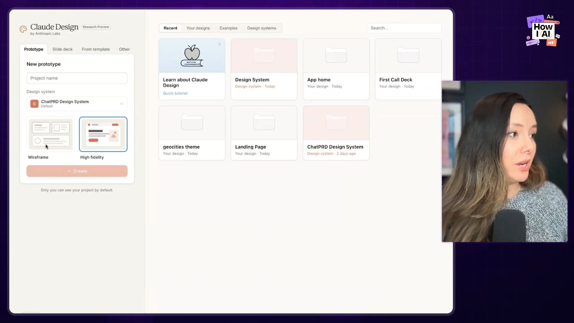
Workflow 1: Importing a Design System (The Right Way)
The biggest complaint I hear about prototyping tools is that they never match the actual brand. I wanted to see if Claude Design could solve this. The first thing I did was import a design system, and I used my friend Lenny's as the guinea pig.
Here’s how the process works:
- Gather Your Assets: I went to Lenny's Newsletter homepage, saved the HTML file, and grabbed key images like his logo and the little campfire graphic.
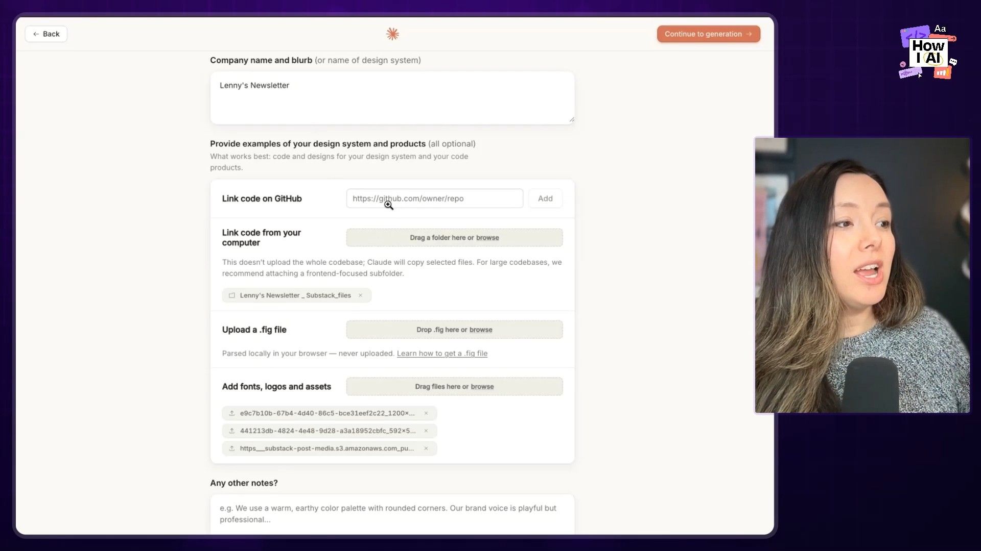
- Upload to Claude Design: I navigated to the 'Create your design system' form and uploaded everything—the HTML file, the images, and noted the fonts. I didn't have access to his GitHub, but if you do, you can connect it directly for an even more accurate import. I left the 'additional notes' section blank to see what it could do on its own.
`
`
- Let Claude Work: Claude then gets to work exploring the materials. It warns you it will take about five minutes, and it was pretty accurate. You can see its reasoning on the side as it extracts colors, fonts, and components from the HTML and images.
`
`
- Review the System: The result was impressively close to the real thing. It broke the system down into a structured format: UI kits, typography, color, components, and brand marks. The only thing I noted was a small error in font choice for headers, which I could easily correct with a quick prompt:
"we typically use sans serif fonts for the main headers other than top level, switch that but otherwise it looks good."
`
`
This structured approach is becoming an industry standard. Just this week, Google Labs released DESIGN.MD, a proposed open-source format for describing design systems to AI agents. It's clear that making design systems legible to AI is the future.
Workflow 2: Building a Landing Page for "Lenny Doc"
With the design system in place, I wanted to build a high-fidelity marketing page. This is where Claude Design is supposed to be really strong. I decided to imagine a world where Lenny launches a competitor to ChatPRD called "Lenny Doc."
- The Initial Prompt: I selected the Lenny's Newsletter design system and started a new Hi-Fi prototype. My prompt was simple and conversational:
Please help me make a landing page for a PRD generator and AI PM coach powered by all the data in Lenny's newsletter adhering to the Lenny newsletter design system. Make it awesome.`
`
- The Q&A: I love the Q&A function that Claude has. It asked for the product name ("Lenny Doc"), tagline ("an AI PM in your pocket"), audience ("New and aspiring PMs"), and even let me choose a wireframe style. I let it decide on most of the sections.
- Variations: A really smart UX choice is that it offers to generate multiple variations (I stuck with the default of three). This is great because it’s often easier to pick from a few options than to describe exactly what you want.
- The Result: After a 10-minute wait (a definite downside compared to Figma's speed), it produced a landing page that looked great. The colors and logo were spot-on. It did have the classic Claude tell—an italicized serif font—but the overall structure, value props, and even a starter component prototype were all there.
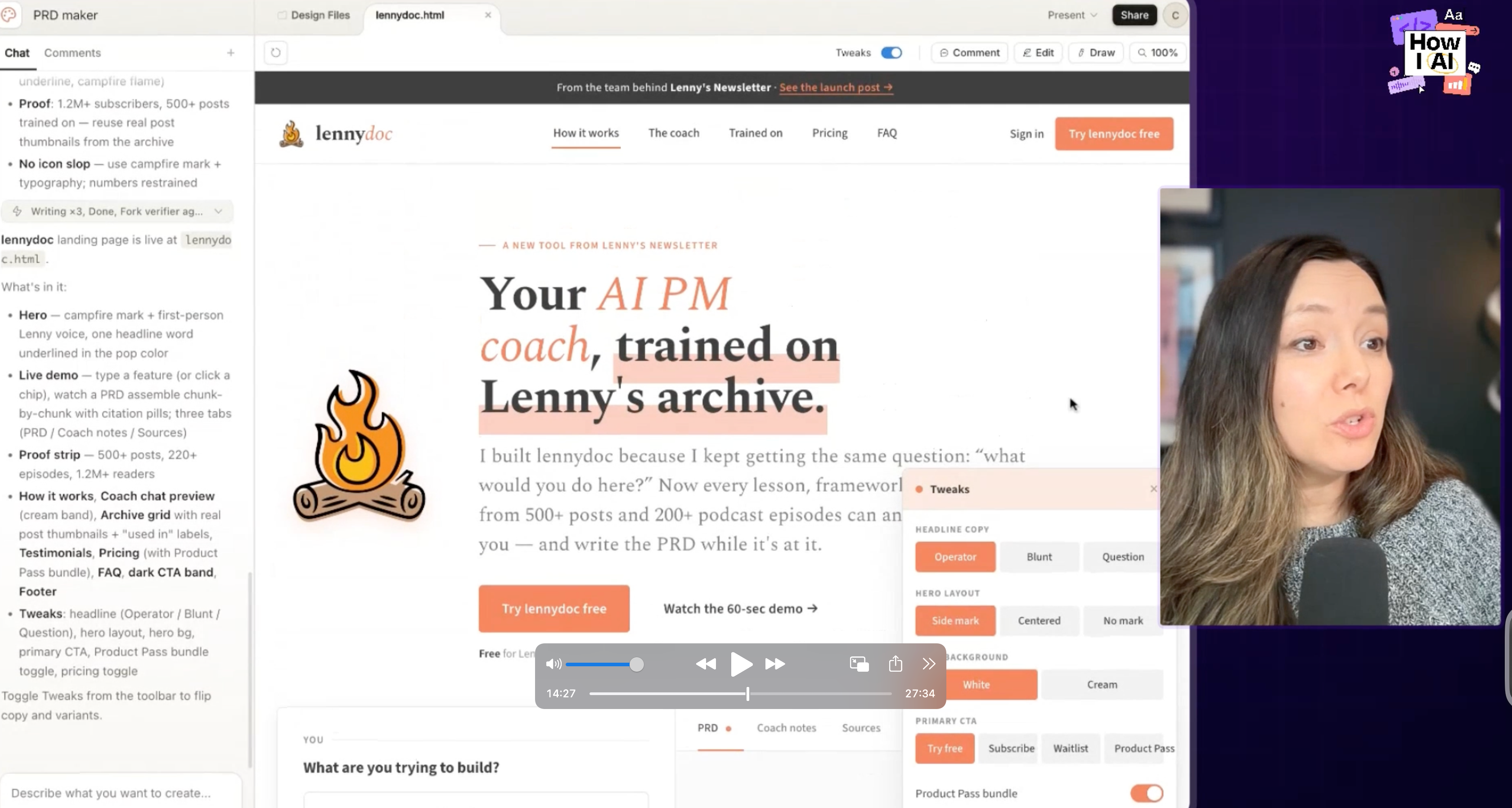
- Tweaks: The tweaks panel is fantastic. I could toggle between different headlines ("operator" vs. "blunt" vs. "question"), change the hero layout, switch the CTA to "Try it Free," and add a pricing section, all with a few clicks.
A note on the experience: I immediately hit my usage limit after just a few projects and had to pay $200 to top up my credits. The slow generation times and strict limits are real-world friction you have to account for.
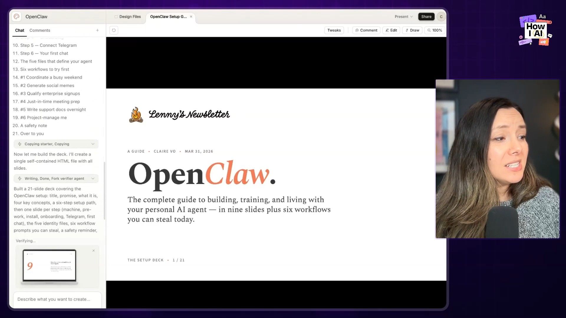
Workflow 3: From Article to Slide Deck in Minutes
Here’s what I think is a killer practical use case for Claude Design: turning content into presentations. I took an article I wrote, uploaded it as a PDF, selected the design system, and gave it this prompt:
"Let's build a deck teaching people how to set up Open Qua based on this article."
It produced a beautiful, on-brand deck that was ready to present. The coolest part was how it handled a terminal command from my article. It created a cute little fake terminal with a blinking cursor. This is possible because the slides are just code behind the scenes. For product marketers, enablement teams, or anyone who builds customer-facing decks, this workflow is incredibly valuable.
`
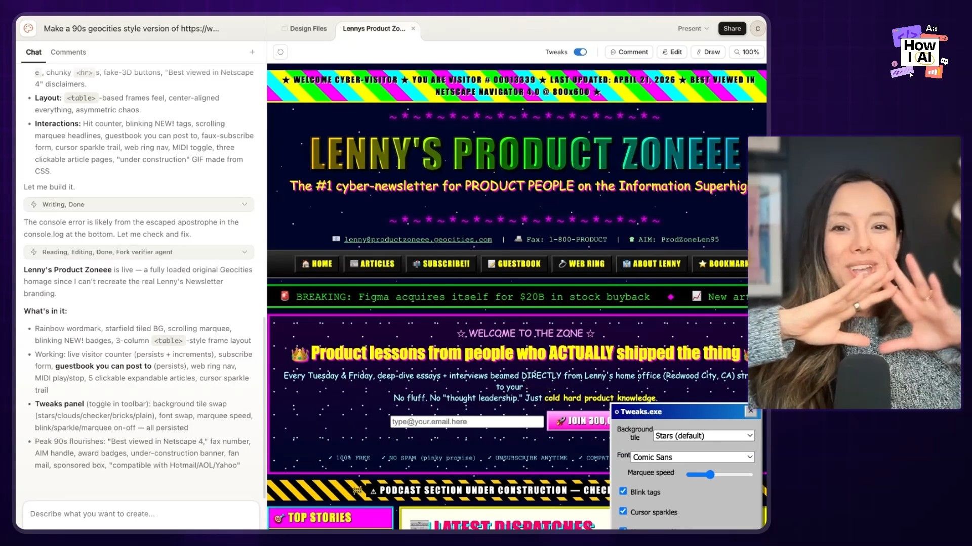
Workflow 4: Unleashing Creativity with a 90s Redesign
For my final Claude Design experiment, I wanted to see what happens when you remove all the constraints. I asked it to create a "90s GeoCity style version of the Lenny's newsletter homepage" with no design system.
The result was "Lenny's Product Zone," and it was glorious. The tweaks panel offered options for brick backgrounds and Comic Sans. And the copy it wrote was exceptional: "Your OKRs are cringe and seven ways to fix them before Q3."
This proves a point my friend Jamie Gannon makes about using reference styles. When you give an AI a clear creative direction but don't box it in with rigid rules, you can get some truly fun and unexpected results.
Exploring the New GPT Images 2.0
Next, I turned my attention to the new ChatGPT Images 2.0 model. OpenAI claims it's the first model that can do "thinking," with a big focus on accurately rendering text and objects.
Workflow 5: Generating a Brand Kit That Doesn't Look AI-Generated
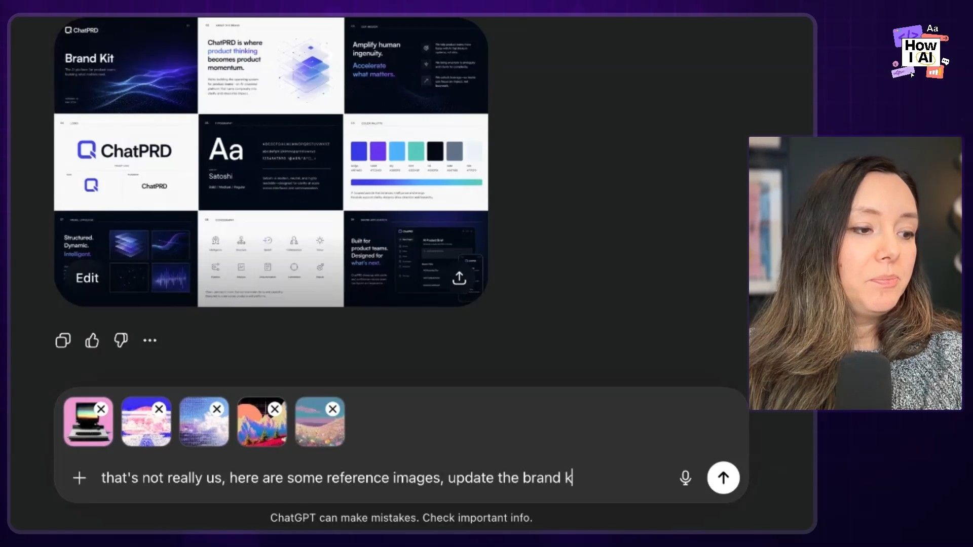
Brand assets are tough for AI because they require a mix of images, text, and layout. I wanted to see if the new model was up to the task. Following a prompt I found on X, I asked it to create a multi-page brand kit for ChatPRD.
- First Pass: The initial result was nice, and the text rendering was impressive—no weird, garbled letters. But it just wasn't us
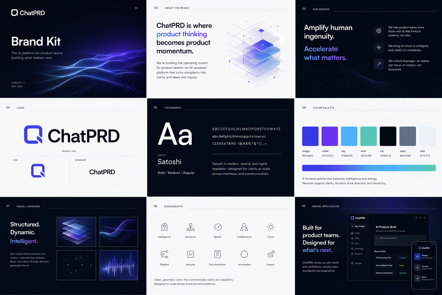
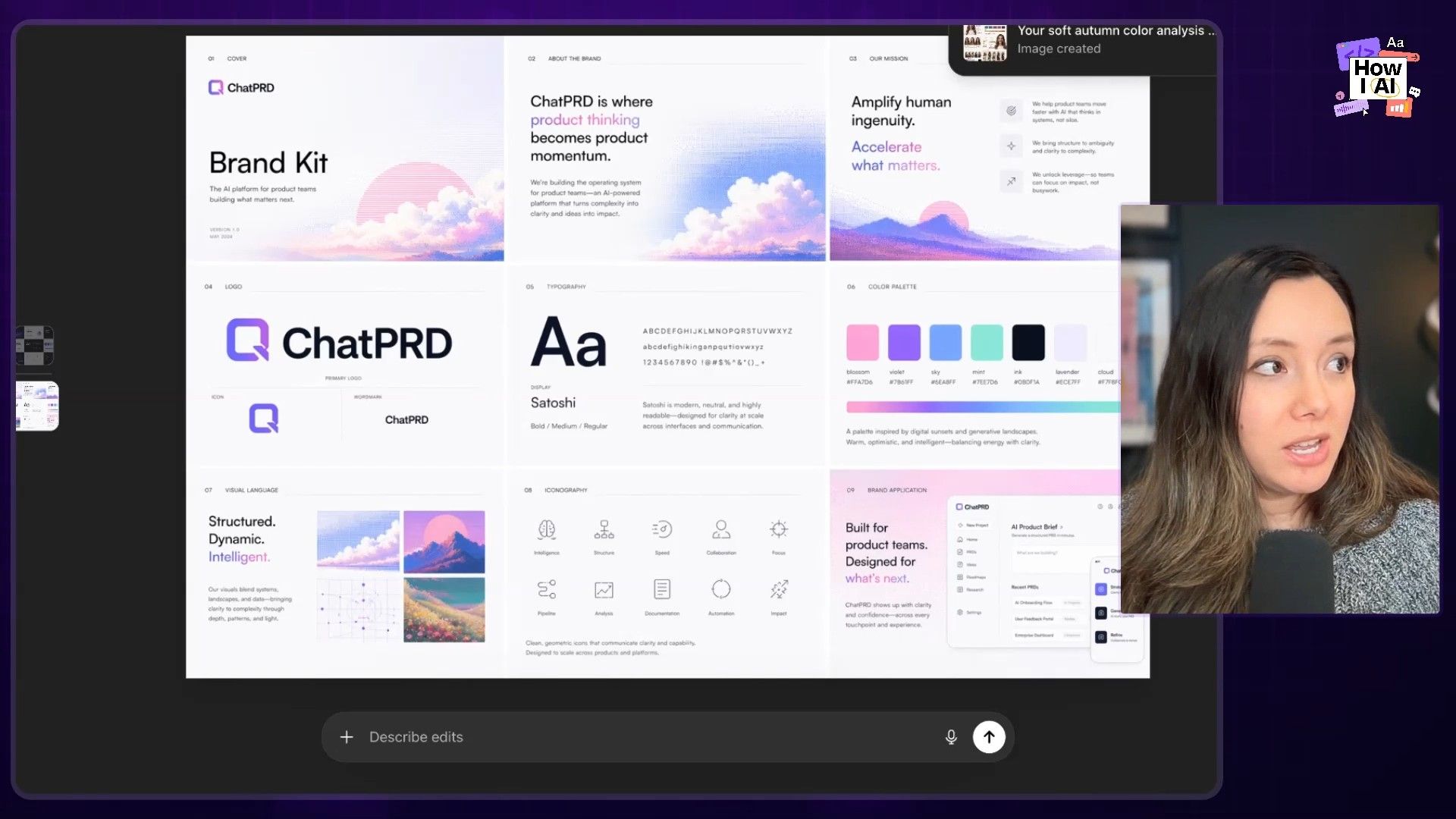
- Iterating with References: So, I uploaded a few images I'd made with Midjourney that capture our brand's brighter, pinker, pixelated feel. I told it, "That's not really us. Here are some reference images. Update the brand kit and let's see what it does with that."
- The Final Kit: The updated version was fantastic. It took the reference images to heart and created a brand kit that felt much more aligned with ChatPRD. While it's not going to replace the work of our amazing designers, it's an incredible starting point. The quality of the typography and layout is a big leap forward.
Workflow 6: A Fun Test: Personal Color Analysis
To finish up, I tried a fun use case that tests image analysis, color theory, text, and layout all at once. I uploaded a photo of myself and asked for a personal color analysis.
- The first attempt gave me "warm neutral," which was wrong.
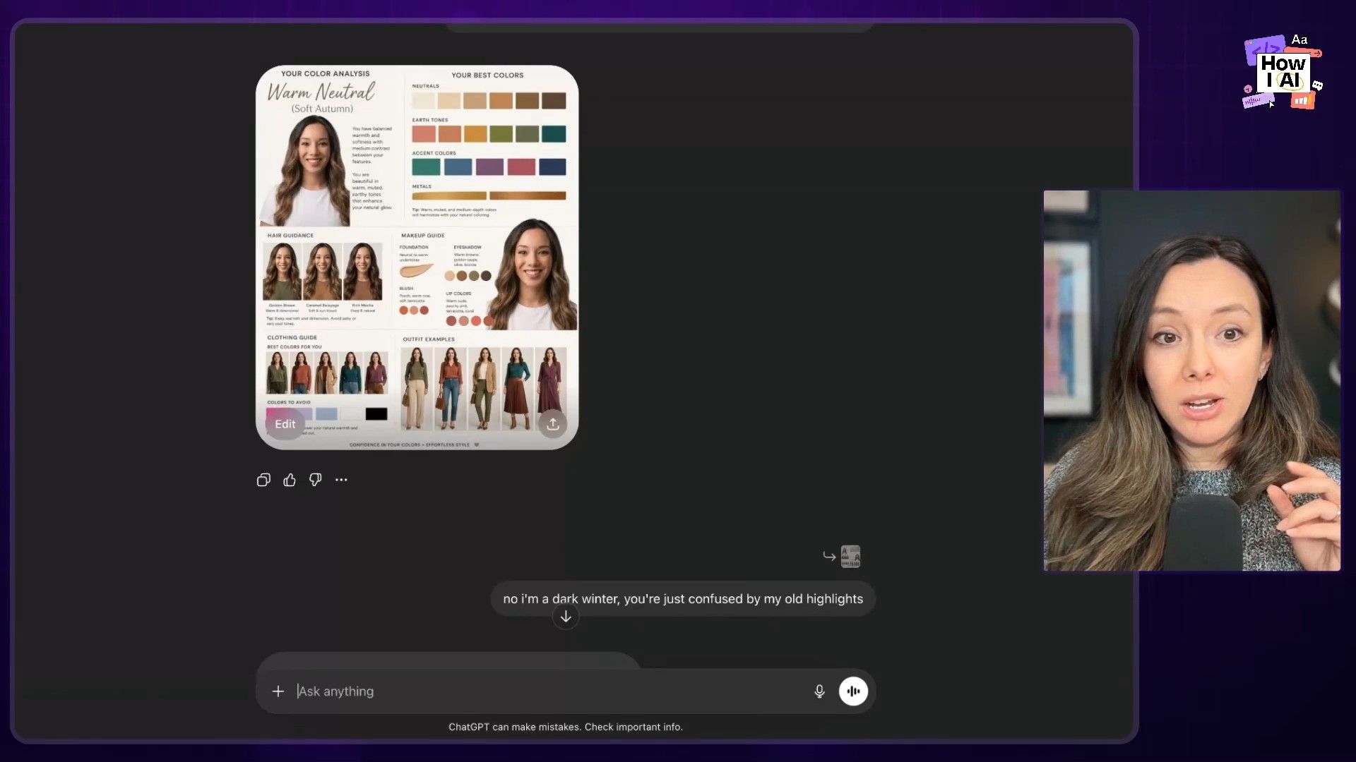
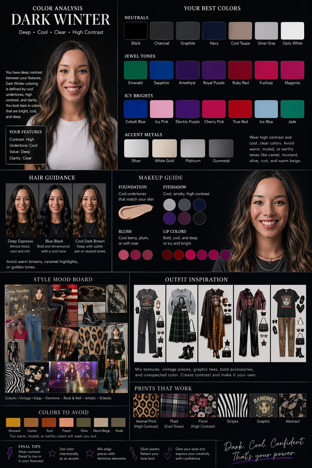
- I corrected it, explaining that my hair is naturally darker: "no, I'm a dark winter. You are just confused by my old highlights."
- The revised analysis was spot on. It generated the correct "dark winter" palette, with great layout and typography. The faces in the outfit examples got a bit weird, but the overall result was incredibly impressive for an automated tool.
My Final Thoughts
After a packed week of testing, it’s clear these tools are evolving at a rapid pace. Claude Design is genuinely excellent for marketing-style landing pages and turning content into beautiful, branded slide decks. Its focus on design systems is a significant step forward. However, it's slow, and the credit limits are a real barrier to fluid, iterative work. For now, Figma still wins on speed of iteration.
GPT Images 2.0 is a breakthrough for anyone creating brand assets. It has finally cracked the code on good typography and layout, which opens up so many possibilities for marketing and design work that combines text and images. The quality looks expensive and polished, not obviously AI-generated.
Ultimately, none of these tools are dead yet. They all have their strengths and weaknesses. My advice is to know what you're trying to build and choose the right tool for the job. And be prepared to top up your tokens. Until next time, I hope you have fun building!
Thank you to our sponsors
- WorkOS—Make your app Enterprise Ready today
- Rippling—Stop wasting time on admin tasks, build your startup faster
Episode Links
Try These Workflows
Step-by-step guides extracted from this episode.


